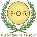
The Cross and the Fish are symbols that
Christians use to convey their most sacred meanings to others and to
themselves. These symbols are a way of saying, "This is who we
are." All moral communities choose one or more symbols for this
purpose. In developing a logo concept for the Fellowship of Reason,
we saw an opportunity to create a symbol that would capture the essence of
our eudaimonistic ethical philosophy and say, "This is who we
are."
One element of the logo is a wreath that looks much like the wreaths of
laurel that were handed out
in ancient Greek culture as awards for personal achievements, such as winning a poetry or athletic
competition. The wreath on the FOR logo is intended to symbolize the life-affirming
nature of eudaimonistic ethics and one's need to engage in personal
growth.
The yellow circle surrounding the "FOR" letters can be thought of as a gold shield,
or
possibly a solar disc. The shield as a whole symbolizes the aim of
life and growth, which is the actualization of one's ideal, flourishing
self. Two of the most basic requirements of self-actualization are
wholeness and harmony, and its reward is a radiant happiness. The
circularity of the shield symbolizes a whole life. Such a life is
not one without needs, but rather one in which one's rational plan for
living does not neglect any important requirement of one's flourishing.
When one has wholeness, one is not forgetting anything crucial to one's
quest for happiness.
The uniformity of color of the shield symbolizes harmony. One
achieves personal harmony when one's motives and aims are consistent with
each other and with one's pursuit of happiness. When one does what
one rationally knows one ought to do, and what one passionately feels one
wants to do, one is able to put all of oneself into one's pursuit of
happiness.
Achieving wholeness and harmony makes possible a radiant happiness.
The golden color of the shield is suggestive of this radiance.
As a whole, the logo symbolizes the flourishing life that our philosophy
of reason is intended to help us achieve. This is who we are.
This is what the Fellowship of Reason is about.
Many thanks to Mark Sulkowski and Ylva
Grefberg for their hard work and dedication in creating the FOR logo!